
You became a yoga teacher to teach, not to think about aesthetics and color palettes for yoga business branding, right?
I get it. Really, I do.
Even if you aren’t thrilled right now about the idea of artfully curating your Instagram or choosing eye-pleasing color palettes for your yoga business, this guide will help get you in the mood. The business of yoga branding mood.
Are you ready to get started?
Let’s go! Let’s tap into your inner designer.
Affiliate Links Disclosure: Naked Earth Yoga is reader-supported. When you buy through links on our site, we may earn an affiliate commission at no added cost to you. Thank you for reading. You can read the full privacy policy here.
How Aesthetics, Color Create Your Yoga Brand Identity
Aesthetics play a big role in brand identity. What a website, blog, or social media page looks like impacts business growth, client acquisition, popularity (think followers), and revenue.
A page that looks pleasant or inspiring can definitely grab attention. A social media account that looks intentionally and artfully designed is often memorable.
Using a coordinated color scheme can go a long way toward getting noticed online. It can even potentially help you hit your business goals faster. Like hitting that six-figure milestone.
First Impressions Count
Several years ago, a study came out that concluded that the average American’s attention span is about 8 seconds. Some think that it’s not that people’s attention spans are short, but that they have too many options to choose from online.
Regardless of one’s stance, what remains is this: as a yoga business owner you have a very small window of time to create a first impression before someone clicks or scrolls on past your business content. What you do with content design, layout, and presentation can help slow or pause the scroll.
And like the Head & Shoulder’s 80s advertising campaign says, you never have a second chance to make a first impression. First impressions count!
Accordingly, color choice, layout, and design can have a big impact on that first impression. Color is influential in marketing and advertising. It can impact whether a person stops the scroll momentarily, follows you, likes your posts, save, or shares your content.
Why Color Matters for Branding
Here are some of the reasons why choosing colors for your business branding (e.g., on logos, social media, website, or blogs) matters:
✅Sets the mood or tone
✅Attracts customer, client, or yoga student attention
✅Allows for connection with different audiences
✅Can help you get noticed — or stand out from your competition
Studies show that there is no denying the powerful impact of color on our emotions, moods, and interactions–which can impact willingness to buy what you’re selling.
For example, colors often mean certain things. Red might convey anger, danger, or urgency. Blue is known as a color to boost sales and squash anxiety.
Creating a Cohesive Instagram Feed or Social Media Presence
Choice of color can help you create a cohesive presence on social media. For example, some yoga influencers and Instagram influencers believe that a coordinated look on Instagram can have a big impact and increase visibility on the popular social platform.
Colors can also help with brand recognition and brand identification. For example, if you use the bright pink color, which I named ‘Goals’ (see below), in your palette, you might become memorable to your social media audience. When that color pops up in their feed, they may associate that color with YOU. With your brand. With your Instagram account.
How to Create a Coordinated Instagram Look
To create a cohesive, coordinated, and powerful business look on social media, like Instagram, consider taking the following steps:
- Choose a color palette that (1) you love and won’t get sick of looking at for a long time, and (2) well represents your yoga business
- Select colors that also tie together your other online sites, such as your yoga blog.
- Choose your grid layout (think visual presentation). There are several popular grid layouts, which include a traditional layout, tile layout, and white/light rows or columns.
- Create a feel and mood (choose a filter for your feed – do you want it to feel bright, light, and airy, or dark, fun, or serious, etc.).
Whatever you decide on colors, layout, and feel, carry this through to your website, blog, and other social media. This is how you can tie everything together to create your very own yoga brand.
LEARN MORE: How to Start a Yoga Business from Home
How to Choose Beautiful Color Schemes for Your Yoga Studio, Yoga Blog, or Instagram
If you’re not sure where to start with finding the perfect color scheme for your yoga branding, check out these colour palette samples that I’ve made for you to stoke inspiration.
Choose a palette or design your own perfect color scheme. Use the same branding colors across all of your yoga platforms and websites or landing pages to create a unified, powerful yoga business image.
You can also apply the same yoga colors to your yoga studio or virtual yoga studio. For example, a gorgeous yoga studio palette or zoom classroom shows branding consistency.
You can even step up your marketing and branding efforts by color coordinating your yoga mats or even your outfits based on your brand colors.
Yoga Color Palette Ideas
The following color palettes are ideas to get your creative design juices flowing. You can find tons of pre-made color palettes elsewhere, however, these example palettes can get you started. Use them. Find others. Or make your own!
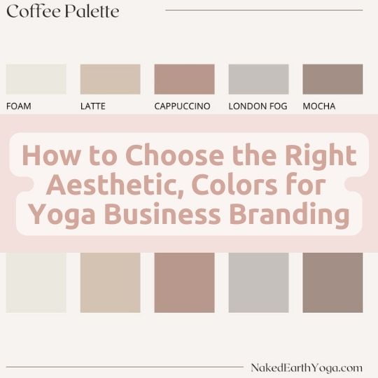
1. Coffee Palette
Since I absolutely love coffee… yeah, I said it…I’m a yogi who loves coffee… the first yoga branding sample below is a coffee palette.
These minimalist hues could look amazing and have a big impact on any yoga, health or wellness website, blog, or social media platform.
READ MORE: To learn how to launch your own yoga website or blog, check out my DIY Step-by-Step Guide.
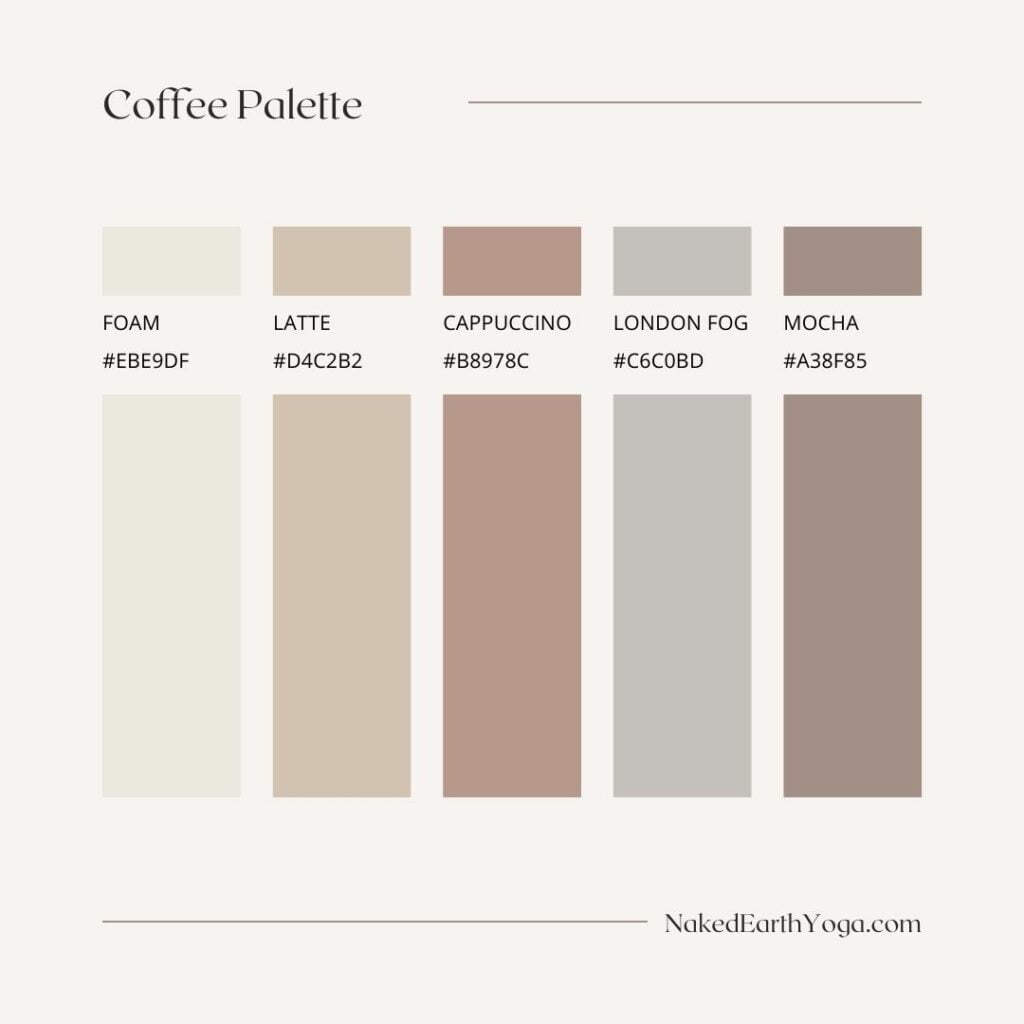
2. Boho Palette
This Boho Palette gives me free spirit, yoga in the desert vibes. What do you think?
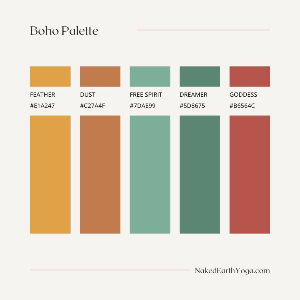
3. Wild Dreams Palette
Go big or go home with your yoga biz with this fun and bright Wild Dreams Palette.
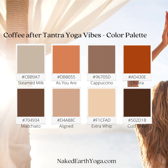
4. Coffee After Tantra Yoga Vibes Palette
Is Picking an Aesthetic, Design, or Yoga Color Scheme a Forever Commitment?
Absolutely not! That’s the awesome thing about digital marketing, online content creation, and social media. You can change things around whenever the urge strikes you–or most importantly, if your business and marketing analytics show you need to pivot in your strategy.
You’re definitely not stuck with a color scheme or design. For example, if you start with a minimalist yoga business branding aesthetic, and you decide it’s not working for your business, you can change it!
Also, don’t think that because you choose a core color palette that you can’t add other colors or accents from time to time. There are no limits or rules. This is your yoga business. You get to run it. You’re the CEO.
You call the shots.
READ MORE: For more yoga business and entrepreneur ideas, check out my 10+ Best Books for Starting or Growing a Yoga Business.
Follow Me on Instagram
Let’s connect. Come follow me on Instagram for more yoga inspiration, yoga business tips + everything self-love.
Leave a comment below. What are your thoughts on these yoga color schemes? Do you think color and aesthetics matter for yoga branding? Do you use a color palette with your yoga business?